Click clack, Retroid is Back
by Joe
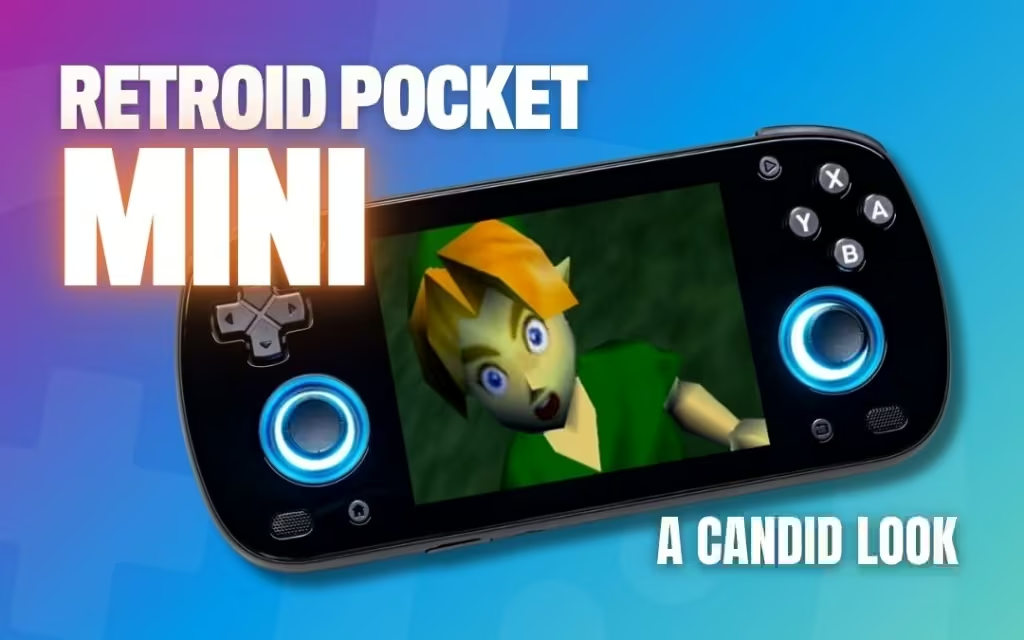
It’s that time of the year again. Retroid has once again bequeathed to us, from underneath a pile of H700 devices and putrid e-waste, a shining beacon of hope to the future of this niche within a niche in the form of a true successor to the original Retroid Pocket series: The Retroid Pocket Mini.
What was a brick is now a polished stone. What was an IPS is now OLED and what *clacks*… still *clacks*. If you’ve followed my articles stemming from the RP2s, RP3 +, and RP4 Pro, you’ll find I am a Retroid nut.
I love their build quality and attention to things that matter in a handheld as well as their price-to-performance. Equal to the praise is my entitled gamer criticism over their shortcomings, like certain Shrek’t up (green tinted) displays or…clacky buttons.
So this will be a fun one. RP Mini, hope or hubris? “Premium” where it counts? Is their implementation of AMOLED glorious or God awful? Should you just wait for its bigger 5.5” OLED sibling the Retroid Pocket 5? Or is this little fella enough for your daily time-wasting screen time crunch? See below 👇.
Obligatory Specification Dump
Probably news to no one, here are the specs for full context with unnecessary commentary:
- Display: 3.7-inch AMOLED / 960P / 4:3
- Intriguing
- Processor: Snapdragon 865
- Smart choice for the price.
- RAM: 6GB
- This is fine.
- Storage: 128GB eMMC
- Cool.
- Battery: 4,000mAh
- Yippee.
- Dimensions: 16.5 x 7.7 x 1.7 cm
- I’m American and can’t comprehend this
- Weight: 215g
- Okay.
I got the black one.
In RAW power, this is driven at a similar performance level with the D1100 in the RP4 Pro and outclasses the RG556’s T810 by a moderate amount. All of this is in line with Snapdragon’s reputation for better battery life and overall Android optimization.
While the SD865 is a 5-year-old chip, that will not matter in the grand scheme for emulation considering it supports both OpenGL 3.2 and Vulkan 1.1. Even with Android 10, your mileage will be pretty similar to that of the upcoming Android 13 re-flash. Unless you plan on playing some current Android titles, I would just keep it at 10.
Other IO includes dual hall analog sticks, hall triggers, shoulder buttons, dual front-firing speakers, a headphone jack, an SD card slot (Wow! Fancy!), and the traditional Android console face buttons: ABXY, Start/Select, back, home, volume control. Standard stuff.
Ergonomics and Button SPEEDRUN!
Some things about this device take up more mental real estate than others, so in an effort to condense this into something readable and spare the editing team from another 2,500-word article (My ZPG A1 Review), here are my thoughts and impressions of the ergonomics and buttons:
Face Buttons (ABXY)
Fellas. They’re the same. In the time of the RP2s, these were a cute, comfy companion to the soft thumpy D-pad, being non-stiff and easy to press. Their size and actuation are NICE. But what keeps me away from wanting to pick up a device with these is the obnoxious CLICK CLACK of every button press, regardless of pressure.
It’s almost like the rubber membrane itself forces the button to make a *THUMP* on the logic board and *CLACK* on its way back up. It’s the same reason I’m not a fan of the Xbox controller. People who are into keyboard noises or Smash Bros. on a GameCube controller will understand the pure Hell of being aware of every button press. They feel great, but sound obnoxious to me. Well so much for a speed run.
- D-pad: Same as the RP3, RP4, RP2s. Vita style, dome switch, and comfy. Next.
- Shoulder buttons: Clicky. I think they can use more cushions like the RP2s, but it’s not a sin.
- Start / Select, Home, Back: They sound like a dome switch-based button. They’re fine.
- Triggers: Stiff… see ergonomics below for why this kind of sucks. I’m not bothered that they aren’t textured. Next.
Ergonomics

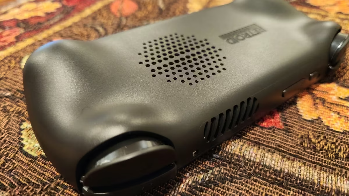
To be honest, the device itself is very versatile in the way that you can hold it. Its curved edges and glass in tandem with the slight ergonomic booty cake in the back give this handheld a consistently alright grip across the board without any immediate notice of slipping.
There’s a slight problem with stiff triggers because more force requires a tighter grip or else you will actually slip and accidentally drop your $200 hunk of plastic and glass over the interstate bridge. To avoid any incidents, I would just use this general grip method above.
That AMOLED and Glass

Hopefully, by now we all know about OLED: true blacks and bright colors, little to no ghosting, little to no power differences with LCDs, and it takes your grandmother to lunch just to brag about you. It is truly a game-changing upgrade over LCDs to the point where going back would require time travel and amnesia.
This 960p 3.7-inch panel is a huge step forward for Retroid and leaves the RP2 series, after nearly 4 years, well behind us. Sure, a 4-inch panel would be infinitely better, but I would take a high-resolution 3.7-inch panel over a 4-inch 480p panel any day of the week, including Wednesday. You would be surprised to see how resolution and brightness affect clarity over sheer size.
Just ask Apple why it tried to trademark the term “Retina”. 960p means that you aren’t going to have to worry too much about integer scaling and having to apply a load of filters to make Mega Man’s healthy breakfast bar look correct (I’ve never played Mega Man). But be warned, there’s a scaling issue with CRT filters.

The all-glass front is kind of annoying because it makes me have to look at more of my double chin than I would prefer on loading screens as well as the constant glare, but it also significantly adds to the bezel-less experience in a way that’s worth it.
I personally don’t care at all about bezels as long as the screen-to-controller ratio is fine, but this is just kind of cool because the true blacks fool my monkey brain into thinking every weird aspect ratio is deliberate. It saves my brain milliseconds of stress but I appreciate it all the same. However…
One Glaring Sin
Okay kids, let’s pull back a second. This is a great handheld. It will play everything up to GC/PS2 very well, but I’m not even covering emulation performance due to the sheer amount of coverage that already exists about this handheld. Instead, I want to annoy you with one thing. Something that I find even MORE annoying — overblown color saturation.
“But Joe, vivid is BETTER that’s why we want the OLED screen!” There is a big difference between color accuracy in OLED panels and having overblown colors. This panel by default is completely oversaturated. Pinks look too red, greens blend together, etc.
The point of having a panel that has 100% sRGB is to show 100% of all the colors in that spectrum, then to be enhanced by the better contrast of an OLED panel. Oversaturated panels move colors more toward red, green, and blue, which kill a large part of your color palette and move your image away from the artist’s intent.
Take Jersey Shore Kirby for instance: The Nintendo Switch OLED panel (default settings) shows an extremely color-accurate image of Kirby Super Star. Pink is pink, greens are varied, and there’s a dynamic range of colors presented here. Next, we have the RP Mini where the colors are harsher and there’s little variation.
“But Joe, I LIKE it this way!” And that is fine, but I’m a firm believer that color accuracy in a handheld device, ESPECIALLY ON AN OLED, is more important. It honestly just hurts my eyes and makes me feel like I’m eating an entire bag of watermelon, green apple, and blue raspberry Sour Warheads.
Example #2, but for something more relatable. Let’s look at the Australian kid’s show Bluey and appreciate its color palette. It doesn’t hold back on its colors but uses a wide and varied, somewhat reserved, selection to paint a more pleasing and dynamic picture without overstimulating your children with dopamine. Cocomelon on the other hand was constructed by Satan himself as a means of corrupting your children with so much harsh RGB colors that they literally become addicted to the constant rush of dopamine.
So I must hate the screen now too right? Well… no. But it does slightly hinder me from playing 2D titles. To me, this is a significant enough issue but to you, it might seem like a nitpick. Side note, there is an option in the display settings to change the color space between Natural, Boosted, and Adaptive settings. For this review, I set everything to Natural to spare myself from going blind AND mad. Man, the gameplay section really died for this huh?
Conclusion and Heart-Pumping Call to Action
The word “premium” to me in the handheld space was something that never made much sense since the products made around it were usually worse: Heavy, wifi sucks, not comfortable, too expensive, too hot, too cold, and eggs my house when I’m sleeping (looking at you RG351M).
This handheld on the other hand has “premium” where it counts. Full range Hall Sticks, a competent Snapdragon processor, good build quality, super sexy glass front, and a super nice 4:3 high-resolution OLED panel.

I do hope that Retroid releases an OTA with a recalibrated screen option. Not everyone likes Jersey Shore Kirby. But otherwise, for $200 USD + shipping, I wouldn’t call it overpriced.
[button link=”https://rh-go.link/Retroid-Pocket-Mini” color=”red” newwindow=”yes”] Retroid Pocket Mini[/button]
What did you think of this article? Let us know in the comments below, and chat with us in our Discord!
This page may contain affiliate links, by purchasing something through a link, Retro Handhelds may earn a small commission on the sale at no additional cost to you.


